PROJECT overview
The product:
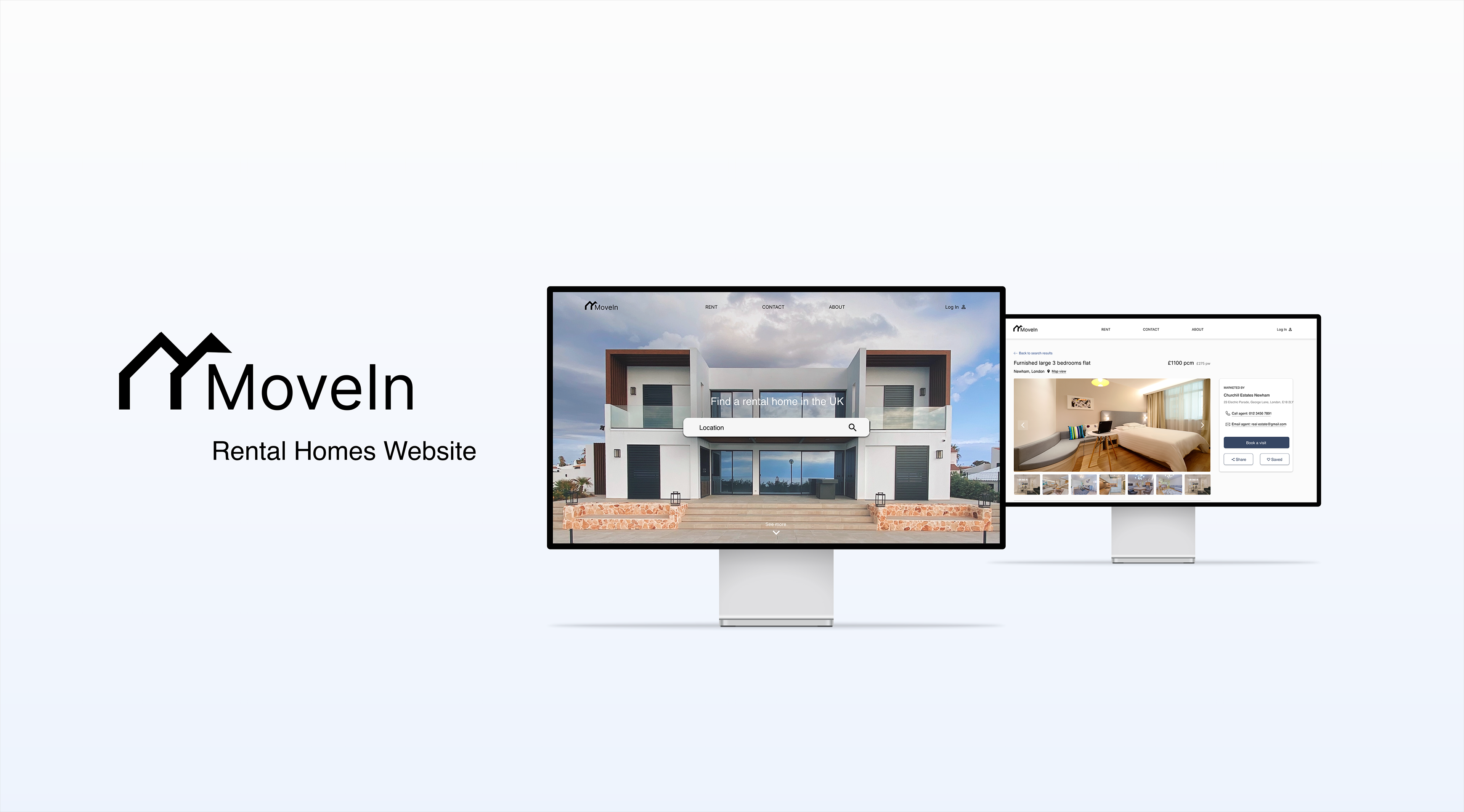
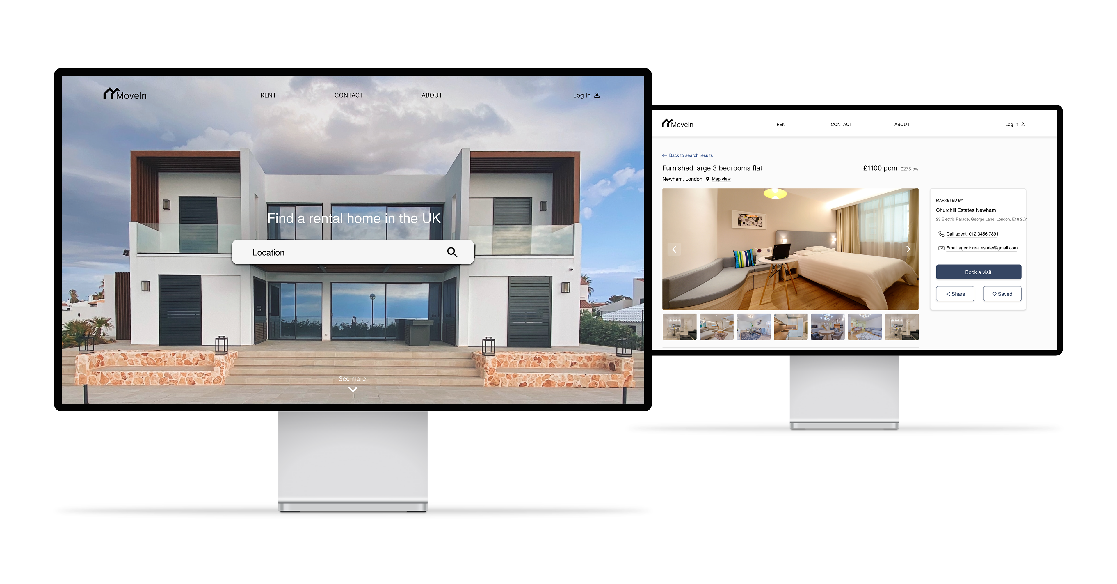
MoveIn is a rental homes website that helps users find a new home easily and quickly. The typical user is 20 - 45 years old, living in the UK. MoveIn’s goal is to make the process of finding rental homes more intuitive and pleasant.
Project duration:
September 2022 - November 2022

The problem:
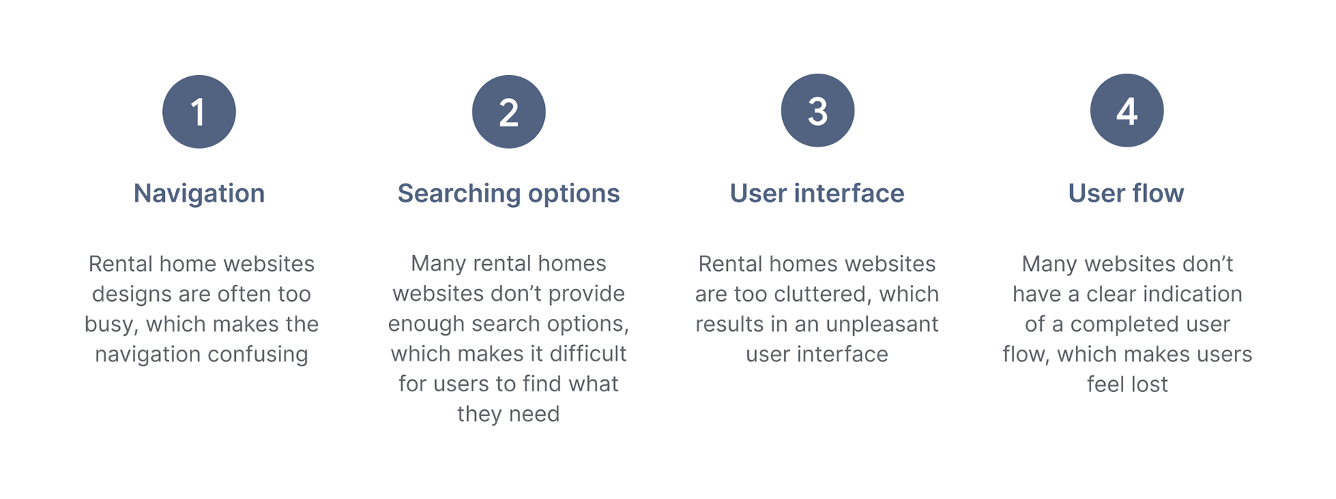
Available rental homes websites have unclear navigation, cluttered designs and confusing search functionality.
The goal:
Design the MoveIn website to be user-friendly by providing clear navigation, intuitive designs and precise search functionality.
My role:
UX Designer - leading MoveIn’s website design.
Responsibilities:
Conducting interviews, paper and digital wireframing, low and high-fidelity prototyping, conducting usability studies, accounting for accessibility, iterating on designs and responsive design.

User research summary:
I conducted user interviews, which I then turned into empathy maps to better understand the target user and their needs. I discovered that many target users face challenges when searching for a rental home on websites because the navigation is unclear, the designs are too cluttered and they can’t find what they want.
Pain points:
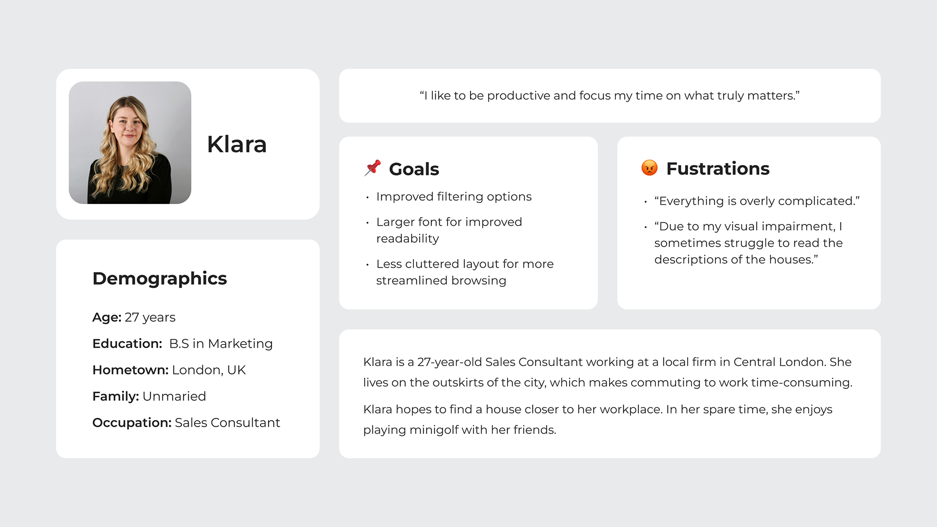
Persona: Klara
Problem statement:
Klara is a busy working adult who needs to rent a home closer to work because so, commuting will save her time that she could spend on her hobbies.
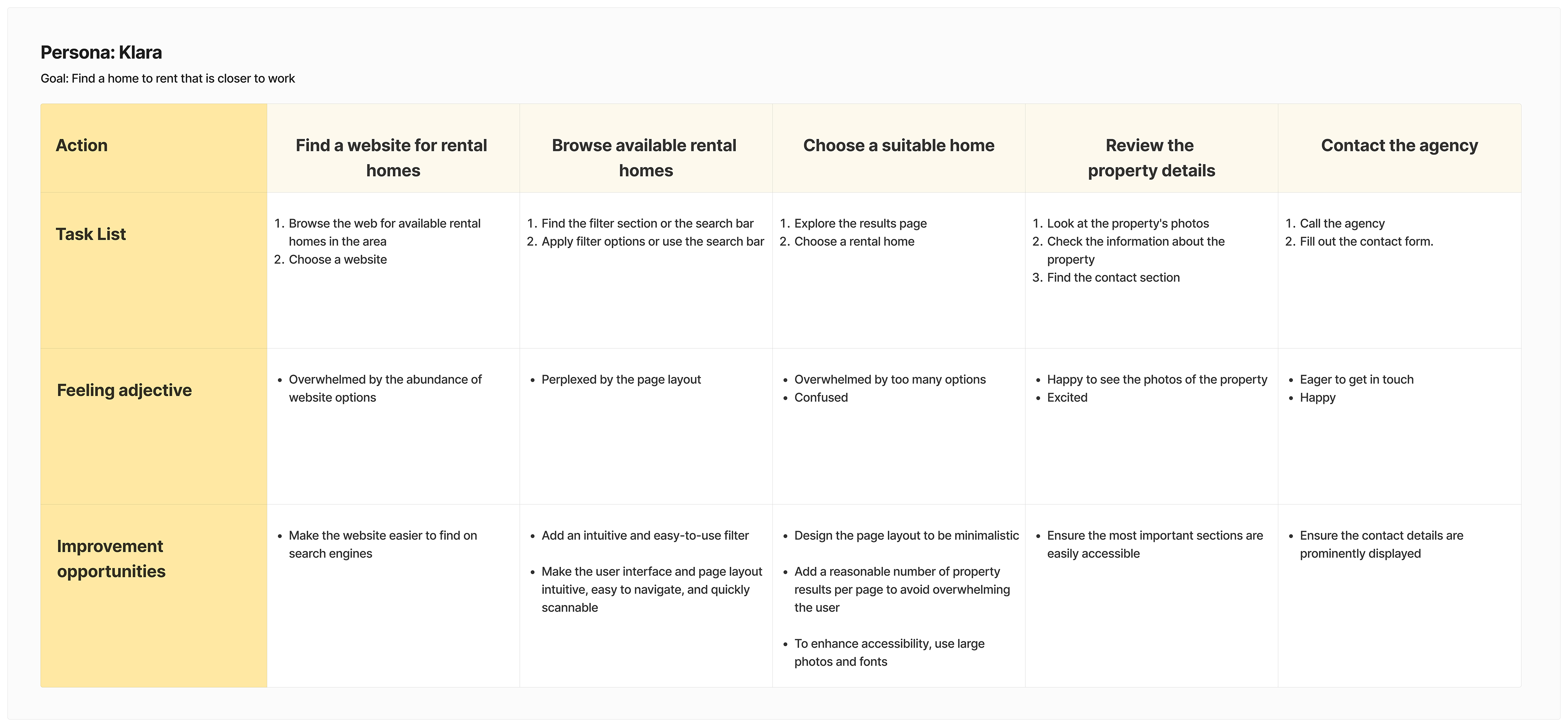
User journey map
I created a user journey map of Klara’s experience using the website to help identify possible pain points and improvement opportunities.

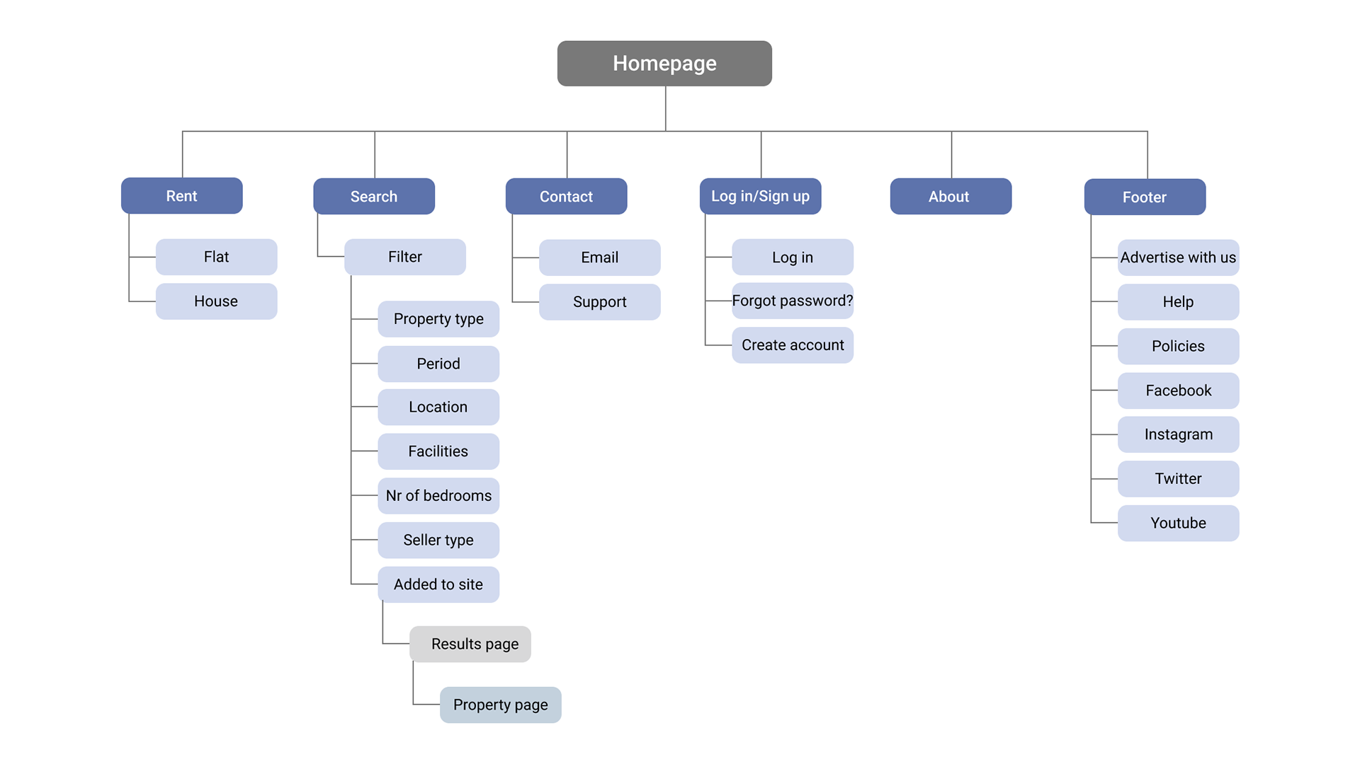
SITEMAP
One of the main user’s pain points was unclear navigation, so I created a sitemap to organize the website’s pages intuitively and logically.
The goal was to create an information architecture that is familiar to users.
PAPER WIREFRAMES
Next, I created various wireframes for the homepage keeping user pain points in mind.
Then I selected elements that I liked the most from the sketches I created and combined them in a final version of the homepage.
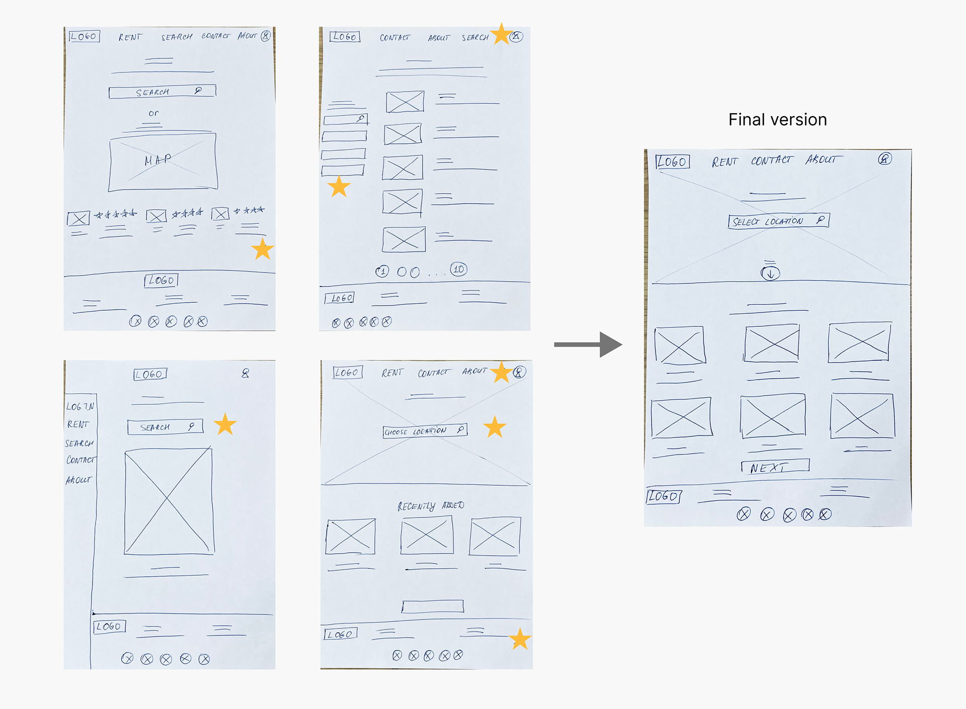
Stars were used to mark the elements of each sketch that would be used in the initial digital wireframes
PAPER WIREFRAME SCREEN SIZE VARIATIONS
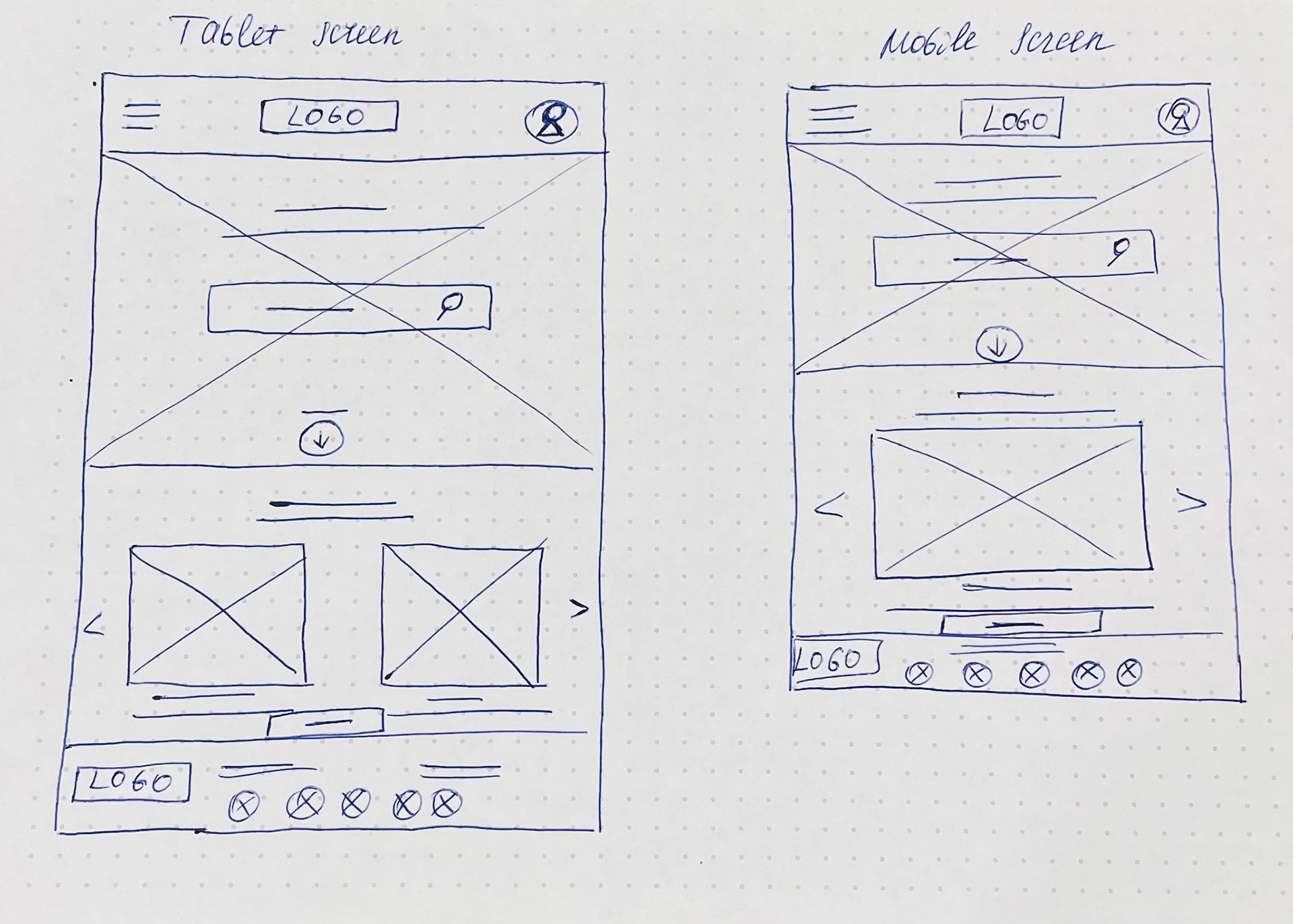
Because MoveIn’s users access the site on a variety of different devices, I started to work on designs for additional screen sizes to make sure the site would be fully responsive.
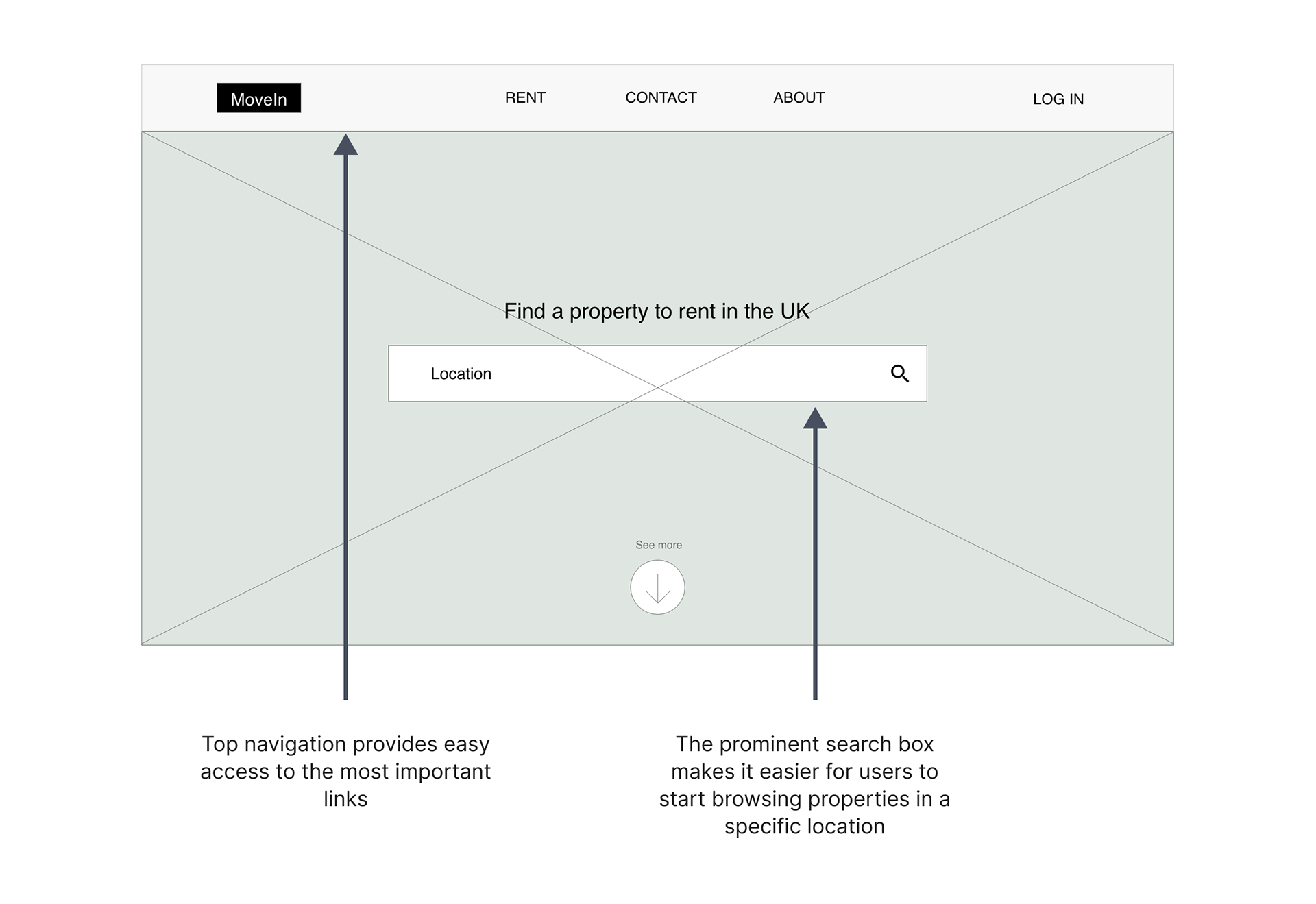
Digital wireframes
I transitioned from paper to digital wireframes keeping in mind the goal to make the navigation intuitive and simple.
To search for a rental home easily, I decided to make the search box more prominent and added it to the middle of the page.
Digital wireframe screen size variations
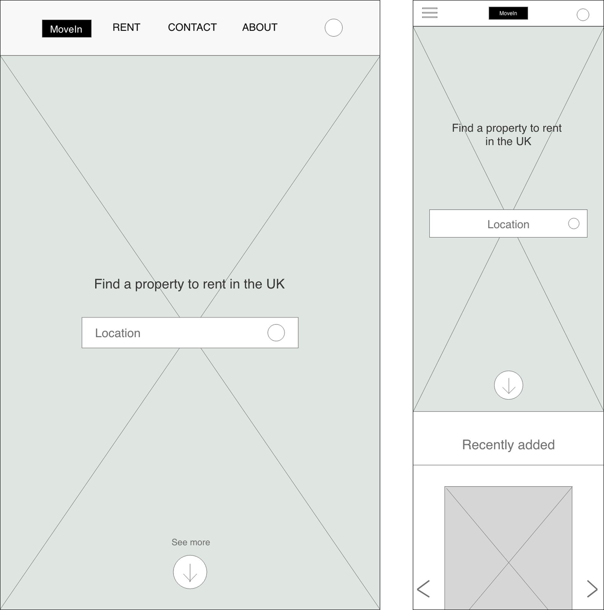
I created additional digital wireframes for tablet and mobile.
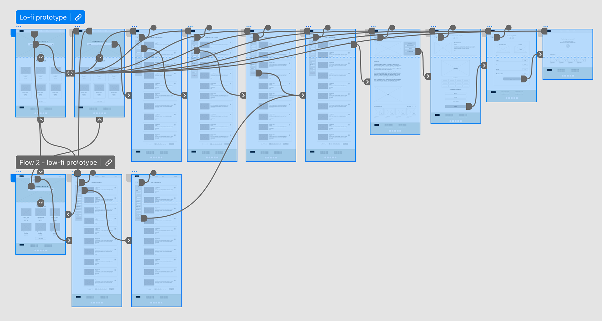
Low-fidelity prototype
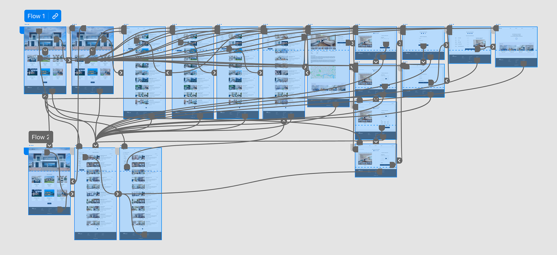
To create a low-fidelity prototype, I connected all of the screens involved in the primary user flow of booking a visit to see a property.
At this point, I received feedback on my designs from peers regarding page layout. Based on these suggestions, I made several adjustments in places that address user pain points.
View the MoveIn website: low-fidelity prototype
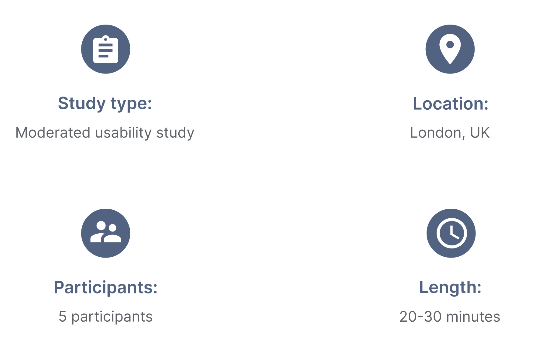
Usability study: parameters
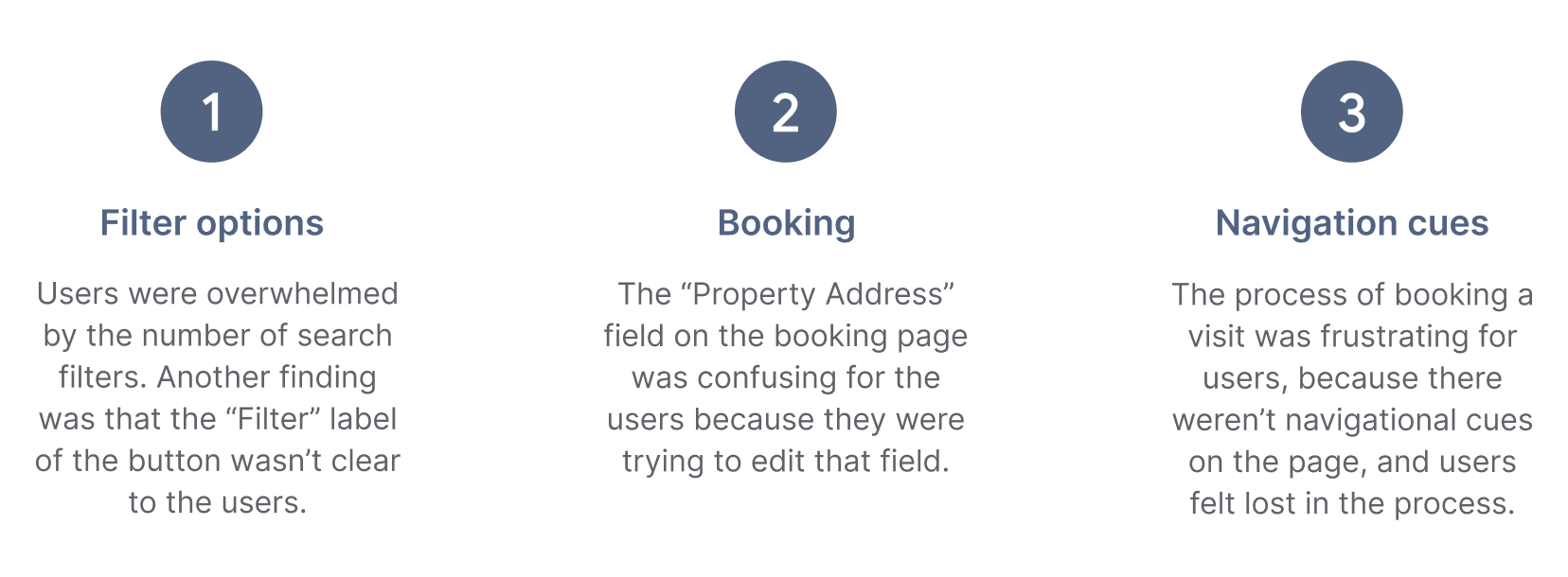
Usability study: findings
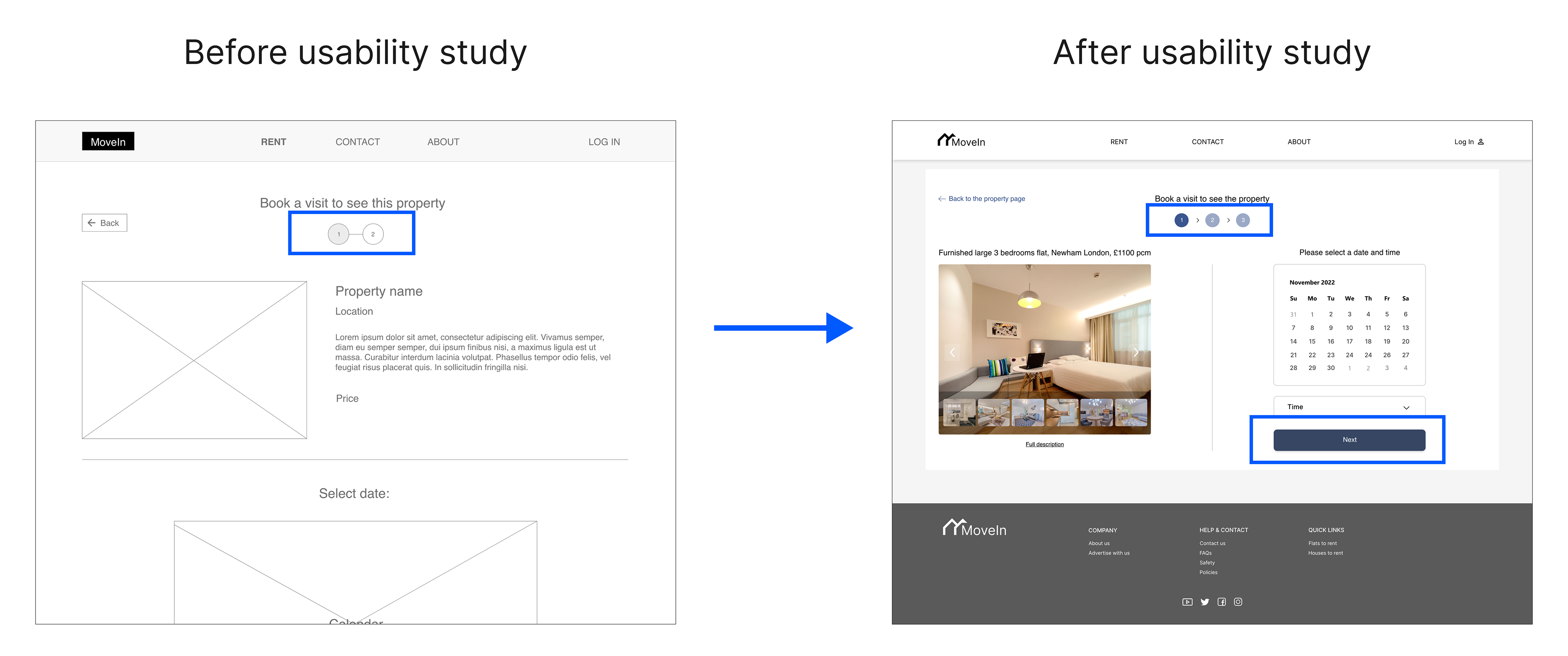
These were the main findings uncovered by the usability study:

Mockups
Based on the insights from the usability study, I made changes to improve the site’s search flow. I reduced the number of visible search filters by prioritizing them.
The more advanced filters are revealed after clicking the “Show more filters” button. I observed that the label of the button “Filter” was confusing, so I renamed it to “Search”.
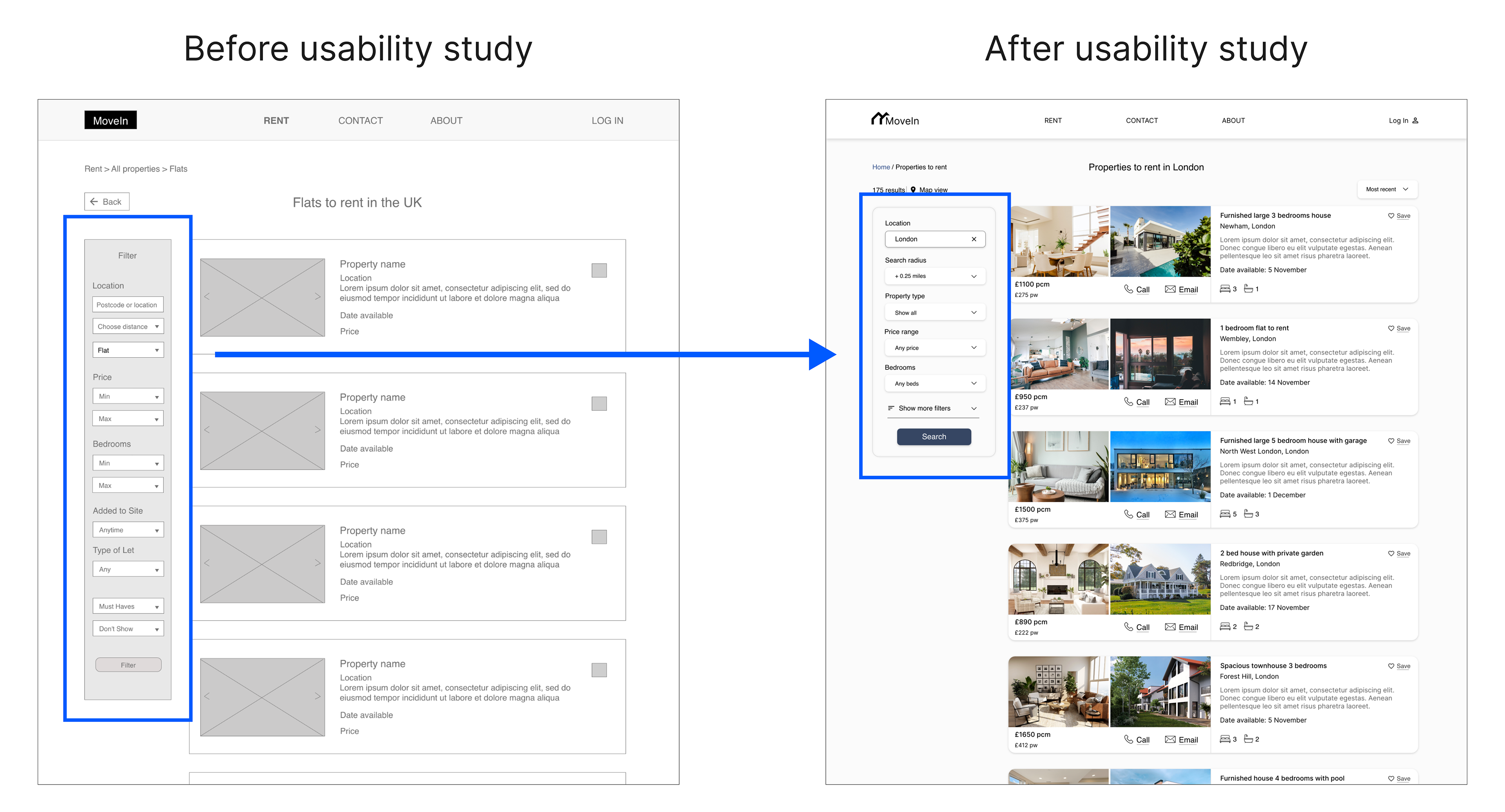
To make the navigation easier, I divided the process of booking a visit into 3 steps. I also made the important information to be visible above the fold, so users don’t have to scroll to find out the next steps.
Mockups: Original screen size
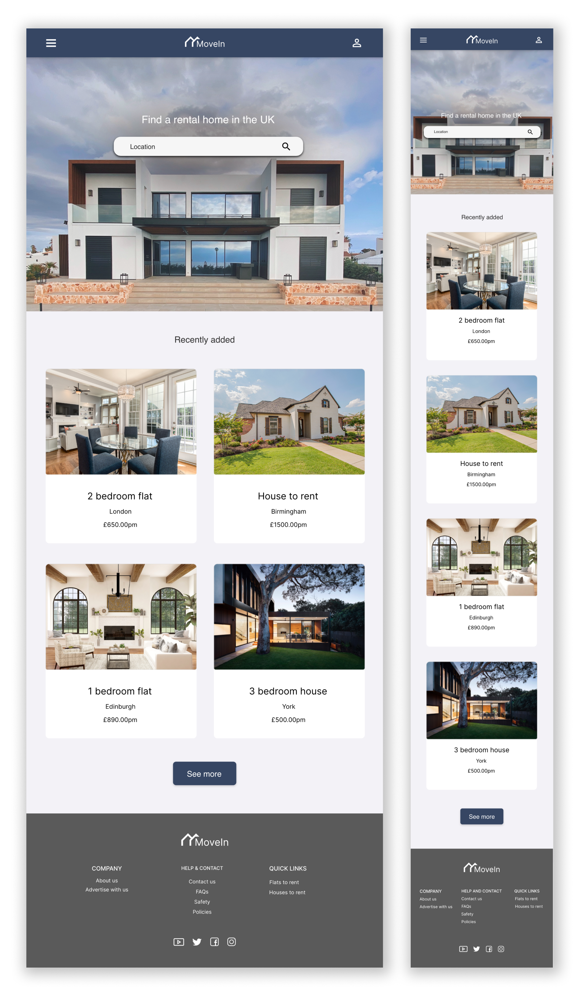
Mockups: Screen size variations
I included considerations for additional screen sizes in my mockups based on my earlier wireframes.
Because users navigate the site from a variety of devices, I felt it was important to optimize the browsing experience for a range of devices, such as mobile and tablet, so users have the smoothest experience possible.
It was interesting and challenging when designing a responsive website because my goal was to keep designs consistent while changing the page organisation.
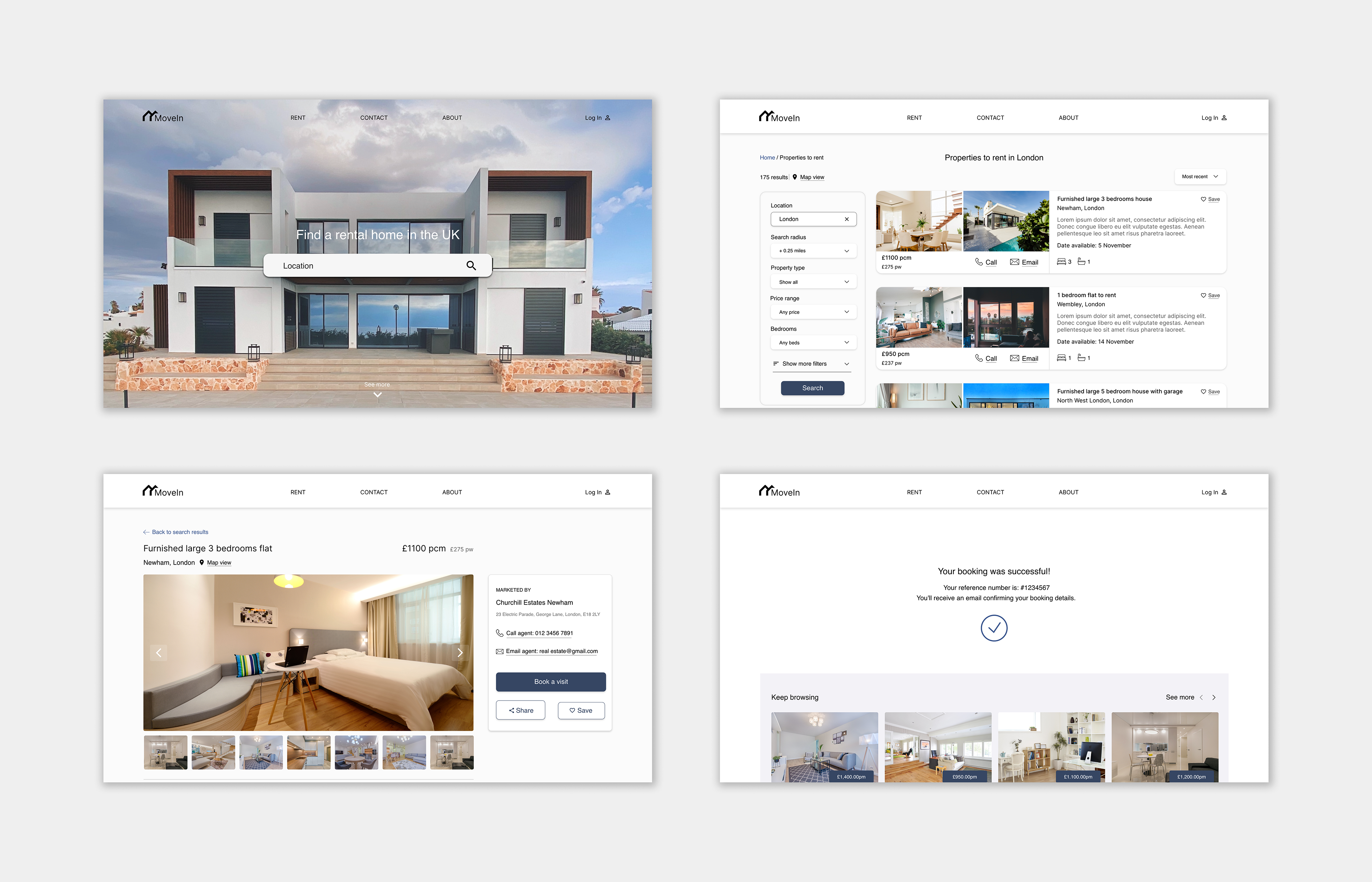
High-fidelity prototype
My hi-fi prototype followed the same user flow as the lo-fi prototype and included design changes made after usability studies.
View the MoveIn website: high-fidelity prototype
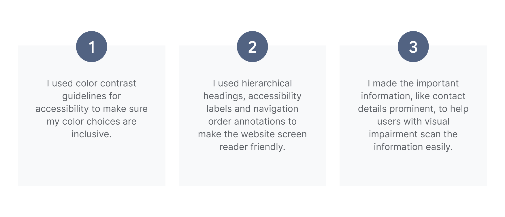
Accessibility considerations

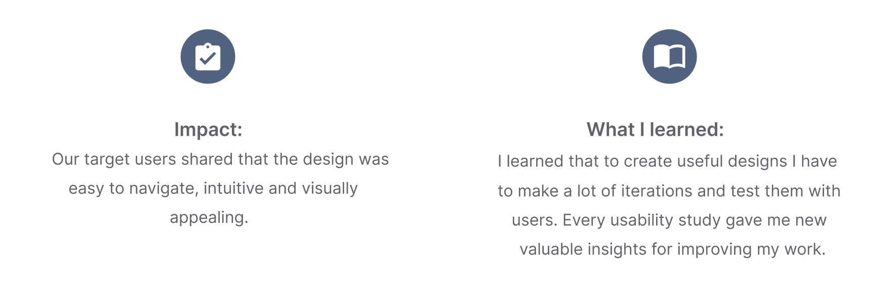
Takeaways
Next steps

Thank you for reviewing my work on the MoveIn Responsive Website!